Gelen personel
Günlük gelen · 14 gün
7/8Bugün
7İçeride
Lixibu UI
Our own interface library. Every screen in our panels is drawn with it: readable instead of crowded, with the same layout on desktop and phone. Below you can try a real product we built with it, LixibuGate.
Live panel · LixibuGate
LixibuGate records staff check-ins with one QR at the door and a phone, then works out hours, overtime and timesheets itself. Below is LixibuGate’s admin panel: the screens come from the product itself, the data from a sample workday of the demo company. Try saving and approving in the full demo.
21 Ekim 2026, Çarşamba · 8 aktif personel
Günlük gelen · 14 gün
Tolerans aşımı · 14 gün
Ek ve tatil mesaisi · 14 gün
Devamsızlık · 14 gün
Giriş yapmış, henüz çıkış okutmamış personel
| Personel | Giriş | Süre | Şube | Durum |
|---|---|---|---|---|
| Burak ÖztürkOfis | 08:18 | 2 sa 24 dk | Merkez Fabrika | Zamanında |
| Ayşe DemirÜretim | 08:19 | 2 sa 23 dk | Merkez Fabrika | Zamanında |
| Ahmet YılmazÜretim | 08:22 | 2 sa 20 dk | Merkez Fabrika | Zamanında |
| Selin KoçOfis | 08:28 | 2 sa 14 dk | Merkez Fabrika | Zamanında |
| Zeynep ÇelikÜretim | 08:32 | 2 sa 10 dk | Merkez Fabrika | Zamanında |
| Elif ArslanDepo ve Sevkiyat | 08:34 | 2 sa 8 dk | Merkez Fabrika | Zamanında |
| Mustafa ŞahinDepo ve Sevkiyat | 08:43 | 1 sa 59 dk | Merkez Fabrika | 13 dk geç |
| Personel | Hareket | Saat | Şube | Konum |
|---|---|---|---|---|
| Mustafa Şahin | Giriş | 08:43Bugün | Merkez Fabrika | |
| Elif Arslan | Giriş | 08:34Bugün | Merkez Fabrika | |
| Zeynep Çelik | Giriş | 08:32Bugün | Merkez Fabrika | |
| Selin Koç | Giriş | 08:28Bugün | Merkez Fabrika | |
| Ahmet Yılmaz | Giriş | 08:22Bugün | Merkez Fabrika | |
| Ayşe Demir | Giriş | 08:19Bugün | Merkez Fabrika | |
| Burak Öztürk | Giriş | 08:18Bugün | Merkez Fabrika | |
| Mehmet Kaya | Çıkış | 06:04Bugün | Merkez Fabrika | |
| Mehmet Kaya | Giriş | 21:5120.10 | Merkez Fabrika | |
| Zeynep Çelik | Çıkış | 20:1020.10 | Merkez Fabrika |
Vardiyası başlamış herkes giriş yaptı.
Captured from the demo panel; each one is a page that runs in LixibuGate today.
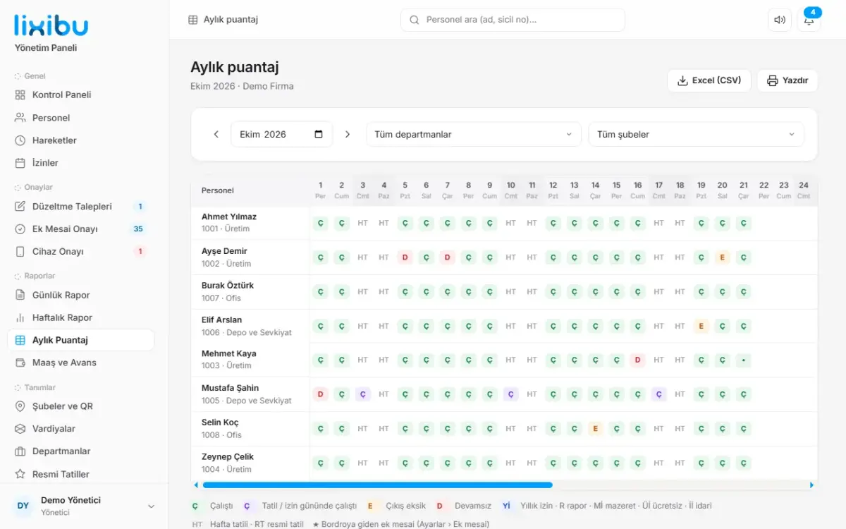
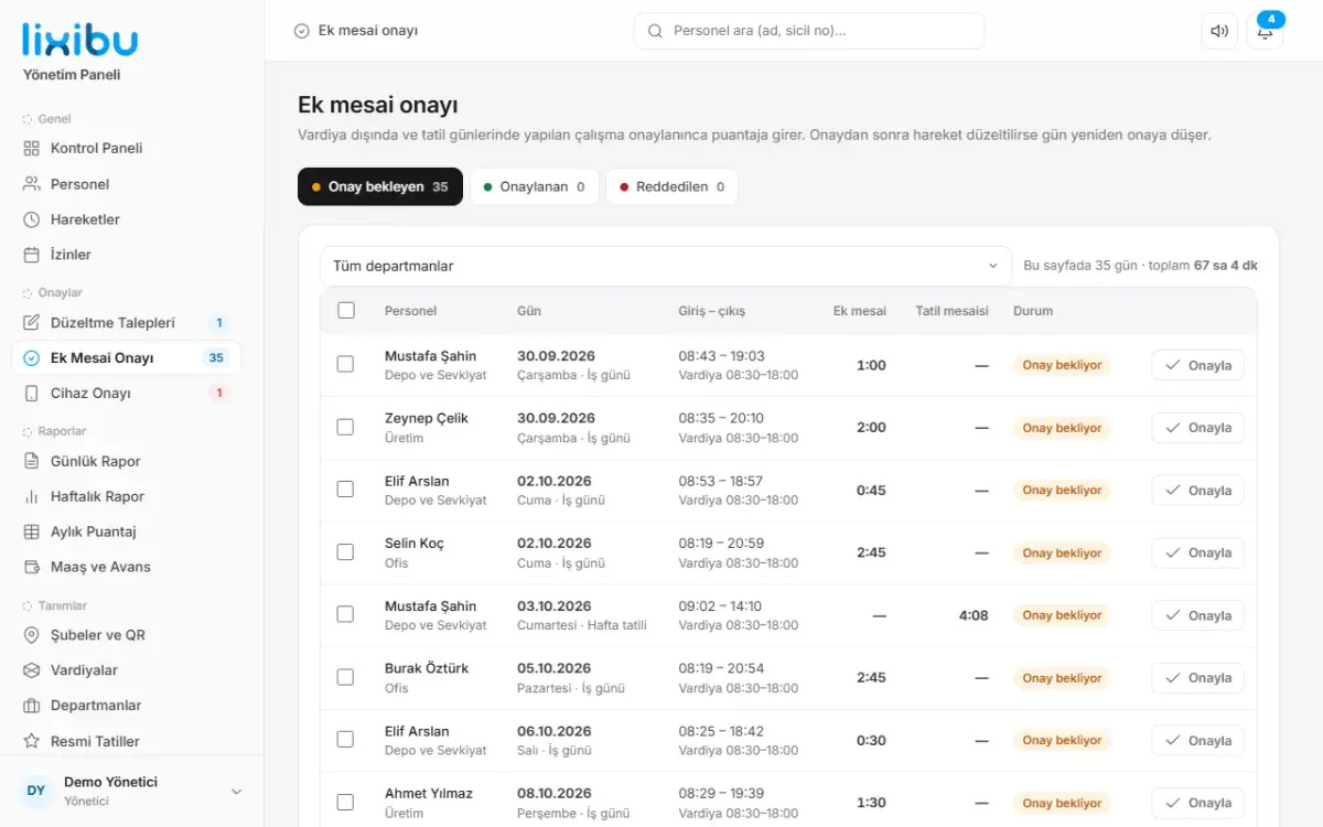
Every panel drawn with Lixibu UI keeps these three promises, LixibuGate above included.
Sections are separated by surface tone, not frames. No boxes inside boxes; the eye finds the day’s key number first.
Area first, then page. Every area opens the same way; learn one screen and you know them all.
Search sits on top of every screen. Staff, page or record: a few letters beat digging through menus.
They’re written in the library’s own docs and every new screen is checked against them.
A panel for your trade or a new face for your existing software: screens built on Lixibu UI work on the phone from day one.
Customize your preferences
Follow us on Instagram!